Monday 14 December 2009

The Silent Planet

Here's a couple of final artwork spreads from the pitch pages of "The Silent Planet".

Title spread from "The Silent Planet"


Interior art, "The Silent Planet"

Monday 7 December 2009

The Silent Planet

Work in progress ink linework from "The Silent Planet"
by Paul J. Salamoff

Over the last couple of weeks in between other things I've been working up some pitches pages of a new graphic novel project, "The Silent Planet" by Paul J. Salamoff, the writer of the Vincent Price issue I completed recently. It's a science fiction story about the crew of a spaceship sent to find a group of scientists on a remote planet.

It's all still very early days with the project but I'll post some more stuff from the pitch pages once they are finished.

Monday 30 November 2009

Get Me Out Of Here

Full page feature illustration crop.

Earlier this month, Steve Sayers, Art Editor on BBC focus and fast becoming my client of the year asked me to produce some illustrations for a feature in the December issue, "I'm an IG Nobel Prize Winner – Get Me Out Of Here!".

The feature asks 6 winners (see more about the prize here) how they would escape being marooned on a desert island. I won't go into too much detail about how they do it, the enterprising amongst them utilising their own creations as much as possible, but if you are keen it is a very interesting article and I suggest you pick up a copy!

As far as my drawings were concerned, Steve had sent me little stickmen roughs placed on the page layout to show how he wanted to illustrate the solutions the inventors had come up with. I simply worked these up into digital colour roughs using Manga Studio for the line work and Photoshop for the colour. Steve asked me to base the style on a "shoes" illustration from my portfolio and I think the simple line and colour gives the drawings a real "Boy's Own" feel, suiting the article to a "t".
Sketch of "Clocky" solution, Gauri Nanda turns an alarm clock into a makeshift solar powered boat to paddle for help on bamboo oars.

Upon approval I then worked up the finals, drawing the ink line digitally in Manga Studio and colouring up selected areas in Photoshop. These sparely coloured finals actually take a long time as you find yourself doing a lot of adding and deleting sections until you find the right balance.

Final "Clocky" solution.


Final "Coconut bombs" solution, Dr Elena Bodnar uses a bra to fire coconut shells filled with gunpowder to attract passing ships.


"Stink" solution, Charles Spence uses a plastic bag filled with vanilla to attract ships by smell.


"Big smoke" solution, after constructing a huge "S.O.S." sign Troy Hurtubise builds a giant fire pit to attract a rescue.


"Coin tube solution", my personal favourite, Len Fisher uses loose change to create an electric current to signal passing ships.


The full page title illustration based on the "I'm a Celebrity" TV show logo.

Monday 23 November 2009

Images 34

AOI Images 34 call for entries artwork by Frazer Hudson

Every year since I was as a student (so, 5 times then) I've entered images for The Association of Illustrators best of british illustration annual publication and show "Images". As per usual this year I checked the list of selected entries and grinned a sly smile to myself as I saw my name was absent. "Maybe next year" I thought.

So, it was to my confusion and brewing excitement that I received an email last week asking me why I hadn't confirmed my page and stumped up the cash for Images 34. A frenzy of emailing back and forth to the organisers followed and after a lot of "we posted things", "I moved house", "Oh, it seems we missed you off the list", turns out my astronaut image below has been selected for the "books" category.

"Today Was Not A Good Day" image selected for Images 34

To put it mildly, I'm completely thrilled. Having a image selected has been one of my major goals both professionally and personally since I first found out about Images in college. Also Ralph Steadman, the reason I got into illustration as a lazy talented kid who was always getting balled out his tutors for not doing his homework and chatting up girls in art class, is in this years book. Me and Ralph. Together in one volume. I can't get my head around that one. Imagine if we're on opposite pages...

So, there's a show, awards ceremony and the all important book which all happens next summer. I'm sure I'll post more information but your best bet to find out more is to check the AOI Images site.

Have a great week.

Monday 9 November 2009

Vincent Price Presents "The Effigy"

So, the other project to come out of my initial round of pitch page promotion was a one shot on the "Vincent Price Presents" series for Bluewater Productions. The issue I've now completed for them is "The Effigy", written by Paul J. Salamoff, and is a classic slice of American small town horror. Scarecrows, cornfields, bullying... all the good stuff!

Inspiration and reference

One of the major discoveries I've had since starting this comic book journey is something I suspected, but perhaps I should have known. Producing lots of images on one page is just like producing one image. The process is exactly the same. Reference, sketch, final artwork. The only difference is you have to do 10 images across a spread over a couple days. As soon as you make any less effort with a panel than you would for any single image then the art suffers.

If you have a strong process as an illustrator I've found you don't tend to panic... or a least you panic less! You simply drop into your system and knuckle down. All the art for this book was 100% digital, sketched and inked in Manga Studio, coloured in Photoshop using a graphics tablet.

I always produce tonal roughs (thanks "classical" Illustration degree) as it really helps with composition and with the colour stage.

Panel Process

Final Spreads


Hopefully no spoilers there! The pages are currently being lettered and I'll let you know when the book's coming out.

Wednesday 7 October 2009

Pitch Pages


So, like a teenage cat burgler, I want to break into comic books and graphic novels.

Well, I don't want to break into a store and steal them, so that unfunny metaphor really stinks, I just want people to pay me to draw them. My illustration work is heavily influenced by comics and graphic novels and I've drawn a few small strips but I've always shied away from trying actual page art as, well, firstly it's really hard and secondly... everyone wants to draw comics so I figured no one would give me a break.

The move to Athens has freed up my week a bit and, taking deep breaths, I sat down and thumbnailed out a pitch script.


I couldn't have dialogue but I would've have put any in as I wanted to concentrate on telling a simple story with pictures. I knew I had to show pacing, mood, action... and in 6 pages I didn't want to trouble myself with concluding anything. I just wanted it to feel like part of a larger story.

I've posted all the pages I sent to around 40 or so publishers below. All drawn in Manga Studio, coloured in Phototshop.


Within a couple of hours I had some responses! When I had finished dancing around the room I started emailing back and... well. There's a couple of projects on the horizon, contracts pending, and when everything's final I'll post all the exciting details here!

Stay tuned. Good things are coming.

Monday 28 September 2009

Patrick Moore


About a month or so ago Steve Sayers, the Art Editor on BBC focus Magazine asked me to produce a full page Illustration introducing a feature on a crash course in astronomy from UK TV legend Patrick Moore. I had done a feature for Focus a month or so earlier and there's no better compliment than being commissioned again so quickly.

The initial verbal brief Steve gave me was "Patrick Moore as a Mekon" which had me grinning like an idiot with the thought of spending time researching Dan Dare, one of my Sci Fi heroes. I dived straight in, gathering inspiration maniacally.

A few of the reference images I gathered.

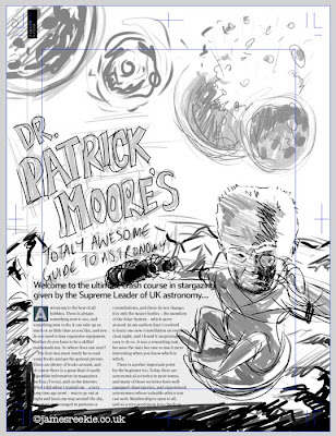
Steve had supplied me with a rough page layout to draw over and, with a pretty clear idea of what I wanted to do, I sketched up a rough straight over the top in Manga Studio using the pencil tool. He had also requested that I do the monster movie type treatment, which I was more than happy to do.


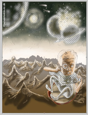
I bought the sketch into Photoshop and quickly splashed some colours over the top, adding in some background options, the one here being spaceships and colliding planets.


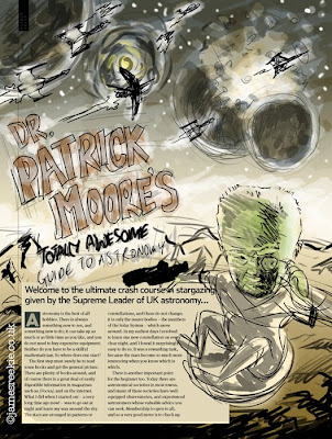
The roughs came back with the comments (paraphrased), "Wow! Loose the spaceships and green head colour. He looks like Frankenstein."

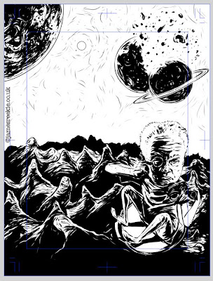
I opened the first rough in Manga Studio and inked back over the first sketch. I went for a heavier, pulp style of linework, pushing up the shadows to reflect the Eagle Comics/Pulp magazine/Monster Movie style I was going for.

I flipped the pose of the arms and sorted out the dodgy binoculars from the rough. I also decided to draw in all the mountains under the type. Now, strictly speaking this was unnecessary, but as the rough Steve supplied contained placeholder text I wanted to help the designer out (having done layout myself) and produce a completed image. This allows the text box to be set to whatever size is needed. Also, it felt better to be working on a full image, rather than with a huge lump of dead space in the centre of the illustration.


I exported the image into Photoshop and began to airbush. I always slap a gradient over the whole image, much like a watercolour wash and then add definition with a transparent toning layer on top. I also add little additional areas of colour blending down. I like to work with as minimal a palette as I can get away with and this technique allows me to keep everything together.

Colour with the ink layer down to 30% underneath.

For the type I tried a bunch of different options, setting in Illustrator, adjusting existing typefaces, tracing and overlaying... In the end I just sketched it out by hand (in Manga Studio again, using a dip pen tool), using movie poster references for style.

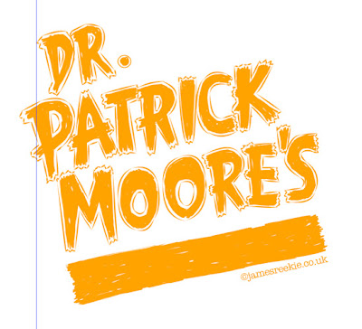
Type artwork. This was then coloured corrected and tweaked in Photoshop.

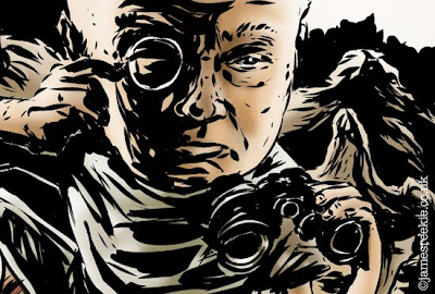
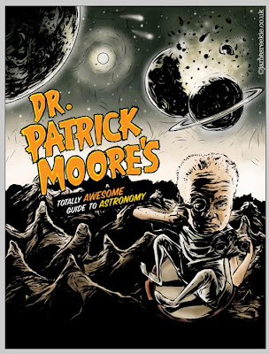
Final image. Published in the October issue of BBC Focus.

Thursday 10 September 2009

Athens

So, if you know me in the "real world" or have been following my twitter, you'll know I have moved to Athens, Greece. For how long it will be depends on how it works out. Service is now resumed and will be exactly as before, except I will be sitting in front of computer in Athens rather than London. Oh, and it's hot here. But it has rained too. To be honest I'm a bit confused about the whole thing.

(Pssssst. I've started a little journal about my experiences emigrating here. Don't tell anyone though, yeah?)


25/9/09 UPDATE: I've deleted it. I wasn't keeping up with it. Greatest plans of mice and men and all that.

Tuesday 18 August 2009

Food Glorious Food


I was asked by the agency to create some food imagery for some potential projects. It's been years since I've concentrated on drawing a sheet of real stuff. Probably since my foundation tutor asked me to work up a whole sketchbook of drawings from life. It's been a fun challenge, but I am a little concerned I've gone a bit "dark" with the drawings... Oh well. Might have another go later in the week.

Friday 14 August 2009

Jumpers for Goalposts


Moving into different subject matter as requested by the agency. I should be posting quite a few different things over the next week or so... depending on moving home busyness.

Thursday 13 August 2009

Watching the rain


Kind of appropriate in the middle of an English "summer". A replacement spread for the book... maybe!

Wednesday 12 August 2009

Office Stress


So, I screwed up with my book.

I got very confused with the online service and whether or not I should include blanks on the inside front and back of the cover.

Whatever I did, I was wrong. All the text printed one page out so all all my rectos and versos were up the swanny. A disaster! Luckily for me it turned out to be a happy one.

I had designed the book with large double spread images separated by black spreads with the text. Seeing the left hand portion of the image first created a great lead in to the image and improved the context of each image vastly. I have therefore decided to redesign the book with this in mind, adding some extra artwork on those pages.

I also decided to change a couple of spreads that weren't working. Below is one of the new images.


Onwards and upwards!

Tuesday 11 August 2009

Look Magazine and Kleenex


One of my images was featured in this Look magazine advertorial about creating a drawing to go on a Kleenex box. It was out at some point in July.

Tuesday 4 August 2009

What Happens When


I was contacted by Steve Sayers, Art Editor on BBC Focus Magazine, to produce 15 Illustrations for a feature on "What Happens When...", answering questions about what the body is doing when itching or blushing etc. This project was very enjoyable and I even got to sneak in a vaguely-Heath-Robinson-inspired creation along the way too! Should be out now in the August issue.

Above image: "Blushing"
"Cramp"


"Farting"


"Itching"


"Cracking Knuckles"


"Heartburn"


"Seeing Stars"


"Sensitive Teeth"


"Twitchy Eyelid"